
Design Thinking – Improve mobility challenges in today’s world
The challenges our cities are facing are different now, as we look at the next steps through the impacts of a global pandemic. As devastating as Covid-19 has been for public transport in terms of ridership, revenue and movement, there are opportunities for the sector to re-evaluate what will come next. Technology will play an important role for public transport to bring back lost ridership and offer a better customer experience.
Design Thinking can be a great tool for city authorities, transit operators, and mobility providers to solve some of the complex challenges. The cities of the future should be built around the lifestyle of the people who inhabit them. Human-centric design is key to the quality of life in cities, putting people at the heart of urban transport planning.
This article will share the concept of Design Thinking and a case study to show transit agencies can use these tools to build human-centric mobility solutions.
What is Design Thinking?
“Design thinking is a deeply human process that taps into abilities we all have but get overlooked by more conventional problem-solving practices. It relies on our ability to be intuitive, to recognize patterns, and to construct ideas that are emotionally meaningful as well as functional.” ~IDEO
Design Thinking’s work processes can help us systematically extract, teach, learn and apply these human-centered techniques to solve problems in a creative and innovative way – in our designs, in our businesses, in our countries, in our lives. ~Interaction Design Foundation
The Process
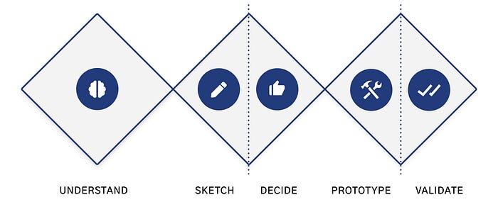
The Design Thinking cycle has 5 phases: empathize, define, ideate, prototype, test — detailed in the image below. The model was developed by the Hasso-Plattner Institute of Design at Stanford (AKA d.school).
- Empathize – with your users
- Define – your users’ needs, their problems, and your insights
- Ideate – by challenging assumptions and creating ideas for innovative solutions
- Prototype – to start creating solutions
- Test – solutions
The follow examples which show the use of Design Thinking approach in transportation space.

Example 1: Improving RTC Nomad Public Transit App: Design Sprint
RTC Nomad App provides collective bus transportation for Quebec City and its surroundings. This design sprint was part of a service consultant offering to collaborate with the digital agency in charge of their new app version development. The case study is shared by Yanick Jimenez.
The RTC App was one of the go-to transit apps in Quebec but there were certain faults in the overall user experience, which was frustrating. From Apple’s App Store, it appears that the interface and experience might have been improved.

Defining The Design Sprint’s Goals
This design sprint was part of a UI/UX service consultancy offering to work with the digital agency responsible for RTC’s new app version development.
The most significant goals covered in the scope of this sprint were:
- Improve critical user tasks and activities
- Develop an interactive prototype to test the usability of major task flows
- Align the app’s UI with the visual identity of the RTC ecosystem
Preparing for the Sprint
The design thinking model adopted by AJ&Smart was used for this problem.
After a brief market study involving direct and indirect competitors including Transit, Moovit, Google Maps and Uber a list of pros and cons of the existing solutions was compiled before the Sprint.
Some of the solutions were personally tested to better understand the field and be prepared to challenge it.
Furthermore, a Google survey was created and launched on the same day to begin collecting data on how users interacted with the app as soon as possible.


Understanding Users
The first day involved evaluating user pain points via app user reviews and validating those points via a quick usability test with app users and non-users.
Finally, by the end of the day, the online survey would be completed, allowing us to analyze the results and discover new insights about the users.
Analyzing User Reviews
The RTC Nomad App had nearly a thousand user reviews in the App Store and the Play Store. These reviews provided helpful information about the application’s flaws and consumer pain points.
Listed below are a few of the most notable Google Play Store customer reviews:

Creating Proto-Personas
After reading dozens of user reviews, it was compelling to create user proto- personas to leverage them to drive design decisions over the next few days.


Gathering Survey Insights
At the end of the day, the online survey published on day 0 was closed and it was possible to recuperate the answers of 7 RTC Nomade App users ranging from occasional to recurrent users.
The following are some of the most insightful findings from the online survey:

These new insights aided us in understanding how frequently users interacted with the app and how motivated they were to help improve it by submitting feedback within the app.
Testing The Usability Of The Legacy App
Testing the usability of the official App with users and non-users was a simple way to validate and reveal more user pain points. We tested different scenarios for creating new routes, adding favourites, and monitoring for delays or interruptions.
As an example, consider the following task scenario:
“You need to leave for work by 8:30 am, create a notification for the app to remind you to leave on time and catch your trip”

Discovering Major User Pain Points
Various valuable pain points relating to the App’s usability and in-app experience were revealed during the usability test; the top five most notable pain points that users were encountering are as follows:
1. Poorly Designed Onboarding Experience
2. Confusing Google Itinerary Redirection
3. Hard to find opposite bus line directions
4. Ineffective Notification System
5. Lacking user feedback and engagement
Other pain points related to the App’s brand identity were also identified. If properly fixed, this could improve the overall real-world user experience, as shown below with the Inconsistent Use of the Brand’s Logo pain point.
When users attempt to download the app, they find it visually difficult to locate the app because the app’s logo in the App or Play store differs from the logo that’s displayed on buses or bus stops throughout the city. This can cause confusion among new users of the App, such as tourists or visitors.
Sketching Wireframes
After defining the problem and identifying various user pain points, Wireflows were built to record user workflows and complicated interactions of the RTC App in order to better understand it and determine how it might be improved.


Sketching allowed to quickly and easily discuss and prioritize potential solutions to the highlighted pain points.

After creating wireframes, I sketched illustrations to improve the app’s onboarding experience:

Prioritizing Use Cases
Due to the numerous insights and pain points discovered during previous days, Most of Day 3 was spent organizing pain points and prioritizing use cases.

Solving Major Pain Points
It was now time to address the prioritized pain points, thanks to the newly created interactive prototype. The following are the top five pain points addressed by the prototype:
1. Poorly Designed Onboarding Experience
When the app is launched for the first time, the user is greeted with three modals requesting permission for geolocation, notifications, and even an update to receive the most recent bus itinerary.

This method introduced unnecessary friction and is not recommended for onboarding new users. The App’s value should be clearly communicated during the onboarding experience, and permission modals can be presented later in the flow.
The proposed solution here focuses on the App’s core benefits, such as the real-time tracking system and notifications feature, as well as the core values promoted by the RTC System through the use of public transportation, such as environmental friendliness, cost savings, and efficiency.

2. Confusing Google Itinerary Redirection
When using the itinerary feature to plan a trip, the app redirects to Google Maps, confusing the user due to the significant unexpected shift in context.

Instead of depending on a third-party rival, users should expect the RTC App to provide this capability. To avoid interruptions in the user’s navigation experience, all user activities should be kept in-house:

This proposal explores how to address this major pain point by keeping interactions within the app and implementing usability improvements such as adding auto-suggestion mechanisms based on recent searches and favourited items, adding visual queues or improving information hierarchy.
3. Ineffective Notification System
The app’s notification system was difficult to find and presented to the user in a confusing manner.
Instead of this clustered notifications page, it was suggested that push notifications based on the user’s most frequently used routes be added and improve the page’s readability.

The fact that this was a critical user need and pain point was quickly confirmed by a fast search on Google trends. Indeed, the most common query at the time was about RTC notifications.

Rather than sharing such a clustered notifications page with users, it would be preferable to add push notifications capability based on the user’s most frequently used routes and improve the readability of the page.

4. Hard To Find Opposite Bus Line Directions
The user had to scroll down and browse through different bus numbers to find the same bus line going in the opposite direction.

Scrolling down and searching for other bus numbers necessitates a higher concentration level from the user. Instead, presenting the information under the same tab would be the path of least resistance to suggest to a user, as demonstrated by the following proposition:

5. Lacking User Feedback & Engagement
Given that 67% of users were willing to provide feedback to help improve the app services, allowing them to rate their trips based on business, cleanliness, and driving quality would be an excellent way to capitalize on the user’s willingness.
Gamification techniques, such as awarding users with contribution badges, could also be used to strengthen users’ feelings of contribution and collaboration while improving the service. Every badge could also promote RTC’s ecological and collaborative values, which are important in public services.

Prototyping Solutions
I used Figma to redesign the most important task flows, such as the onboarding experience, trip scheduling, and alert customization.


Validating Solutions
An in-person usability test with three app users helped us validate that the significant task flows addressed the user pain points as intended.
Following that, the entire case study and various other suggestions to improve user experiences, such as in-app ticketing payment and phone scanning, rush hour notifications, display of tourist attractions, and other recommendations, were shared with the digital agency in charge of developing their new app version.

Example 2A: Design Thinking to improve UX in public transportation - EMT Madrid
EMT (Empresa Municipal de Transportes de Madrid) is incharge of public transport public urban transport in the city in Madrid, Spain. The company runs a fleet of 1,900 buses and 100 mobility aid vehicles and operates a network of 203 bus routes (176 daytime, 26 night-time, and Airport Express). The case study is shared by Violeta Goldin.
The Problem
The city conducted the study and realized that each year there are fewer customers who use this means of transport and users are more dissatisfied. The operator wanted to improve the experience of bus users and was looking for a technological solution to increase the users’ satisfaction towards accessibility during the bus trip as well as when waiting for the bus to arrive.

The Project Scope
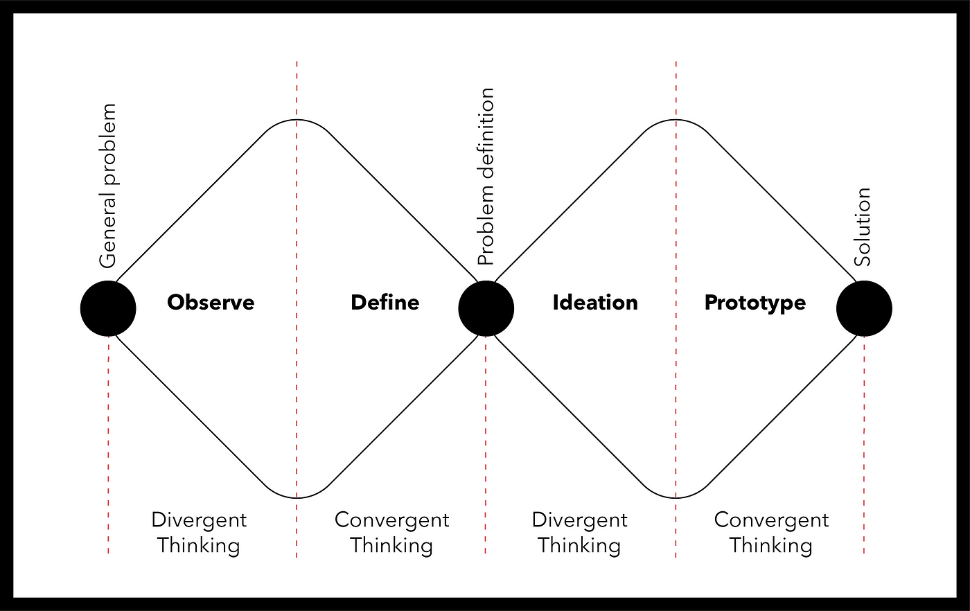
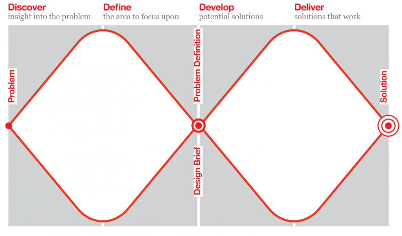
The method to make this project was a double diamond design thinking, which consists of divergent and convergent thinking, through observation, definition, ideation, and prototype. Starting with a general problem, then its specification, and approaching to a final solution at the end.
Research
The research process begins with an exploration focused on the user, the client, and its competitors. Every question the team could think of, related to these three topics, they wrote on post-its and sticked them to the wall. This is how the process started to lead the investigation. Some of the questions:
- How is the user experience with the app?
- Which problems does a disabled person face when traveling?
- Does the company offer good technological services?
- Does the competition have specific services for disabled people?
The case study is adapted from the original publication by Violeta Goldin
Design Thinking to improve UX in public transportation – a UX case study @ UX Design (October 2018)
👋 Social Media! Medium, Linkedin
💻 UI/UX design work: Portfolio
Discover
The team used different techniques to look for the information and empathize with customers.
Desktop research
By doing desktop research based on the competition, the team collected data of alternative transportation to the bus, such as VTC, taxis, and other kinds of public transport. They also gathered information on mobile apps and disabled people-oriented apps.
The team concluded that almost every public transport service in the country offers the same solutions for people with reduced mobility, such as assigned seats, reserved platforms, and ramps for wheelchairs.
On the other hand, they found many apps committed to disabled people, and none of their functions are contemplated in the EMT Madrid’s app.
VTC, taxis, and every car-sharing service present direct competition to the EMT due to their capacity of covering the users’ routes extensively.
Qualitative research
Following the investigation, the team collected opinions and comments from users in numerous blogs and EMT’s social networks. They found several claims for malfunction of the ramps, and other comments such as ‘buses rarely have their sound system on’.

In order to extend the qualitative investigation, the team made a safari to the EMT buses. On a rainy day, they studied the user’s experience using public transport and witnessed some problematic situations, for example, a senior citizen couldn’t get to the central platform because the bus was highly crowded. Other elderly people weren’t able to reach the reduced mobility assigned seats and had to travel standing since there was no other option. Furthermore, the information screen set in the front of the bus couldn’t be seen from the back, and in other cases, it’s not even turned on.
Questionnaire
To better understand the general experience of EMT users, the team created a questionnaire through Google Forms. The following graphics represent the experience and interaction of the users with the public buses. First, one can see that a big percentage use this transport occasionally. Secondly, most people get their information through the EMT app. And finally, that people use this form of transportation to get to their working places, schools/universities and for leisure.

Interview
Once we defined a script for the interviews, the team headed to centers and foundations directly related to people with reduced mobility. During the interview, the employees told the team about the need of programming the interviews with some anticipation. Due to the insufficient accessibility to move around the city, people with reduced mobility have very strict routines.
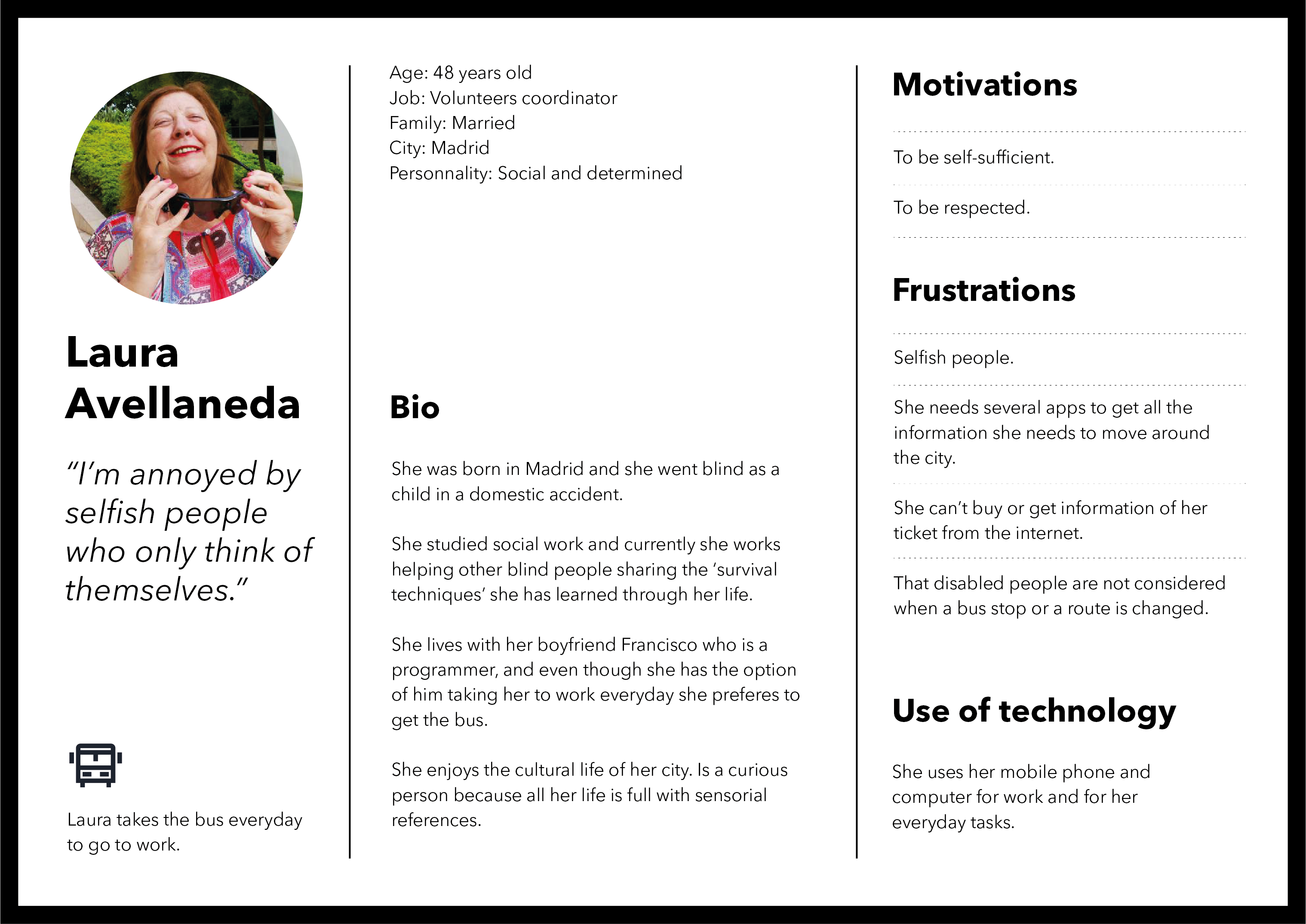
Finally, they managed to get an interview with a blind woman in the Fundación Once, previously scheduled to avoid causing any inconveniences. Lucía, Fundación Once’s volunteer coordinator, told us about her daily routine, how she moves around the city, her experience with public transport, and the importance of technology in her life.
Define
User Persona
Based on all the information collected in the questionnaires and interviews, the team generated two User Personas. Senior people represented through Juana, and disabled people through Laura. This process helps to achieve a unification of the team when defining the specific problem, as every member can follow the same line to find a solution.

Empathy map
The team developed an empathy map for each User Persona, defining their experiences when taking the bus, focusing on what they think, feel, see, hear and say. These maps helped to empathize and synthesize our observations.
The team realized the need for disabled people to get external help when interacting with the whole service, such as waiting for the bus as a blind person and not knowing which bus it is unless asking someone. Or, when inside the bus, not being aware of reaching their stop if the sound system is not available.
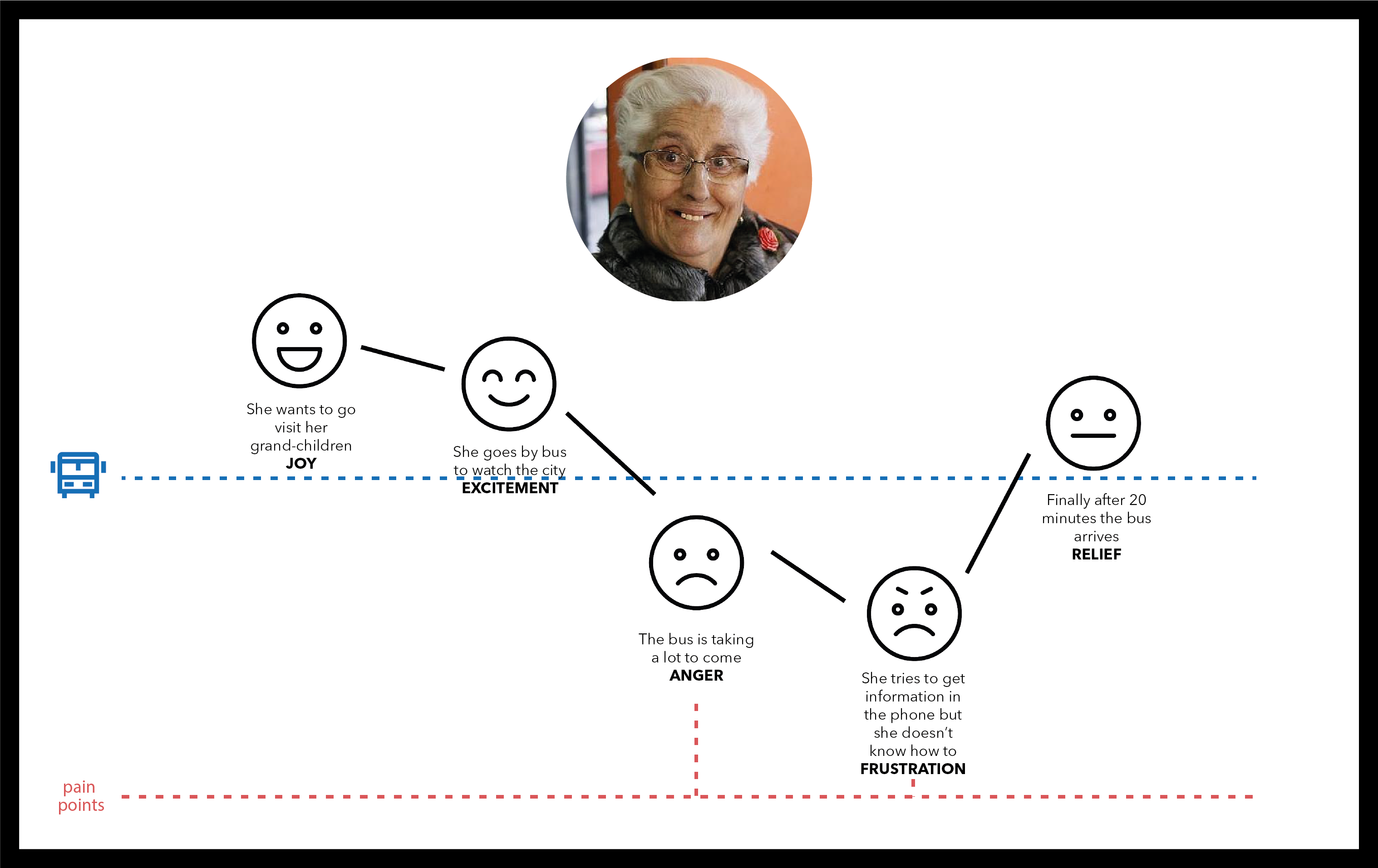
Customer Journey
Based on the previous maps the team created the user’s journeys, graphically represented their interaction points with the EMT service, and at the same time their pain points. These are the key points where the team is going to focus their challenge next.

Insights
Before defining the specific problem to attempt to find a solution, the team marked some key points of their research. From different selected findings, they defined the insights that will take them to a viable fix:
- Need of an app that unifies different others.
- Need of self-sufficiency of people with reduced mobility.
- Need of inclusion confronting differentiating systems.
- Need of information regarding the streets traffic and type of bus.
To proceed to the next step of specification of the problem and definition of the challenge, the team decided to use the How Might We questions process, centered on the insights previously defined. After voting the posed questions, which will help them to find the adequate solution to fix the pain points marked in the customers’ journeys, the team established their challenge:
Creating a tool that unifies the needs of a disabled person travelling by public transport.
Develop
Ideation
This phase was started by doing a MoSCoW, in which we included all our ideas for tools that could offer a solution to the pain points based on the interaction of the user and the service. Ideas were divided according to their priority. In the area of Must, the team incorporated all of those they thought were crucial to our solution. Afterward, in Should those which thought were very important, in Could those which considered we could dismiss. Lastly in Won’t, those which completely dismissed.

Keeping in mind the objectives defined in the briefing, the qualitative and quantitative research, and the insights collected the team found the idea to be proposed as the solution: a redesign of EMT’s app.
Inclusive and collaborative solution that synchronises in real time relevant information of the door to door route, taking advantage of the accessibility tools that the smartphone offers, in order to make it universal.
As well, the solution implements a gaming process with the aim of encouraging the user to participate in the community, collaborating, and getting bonuses in return.
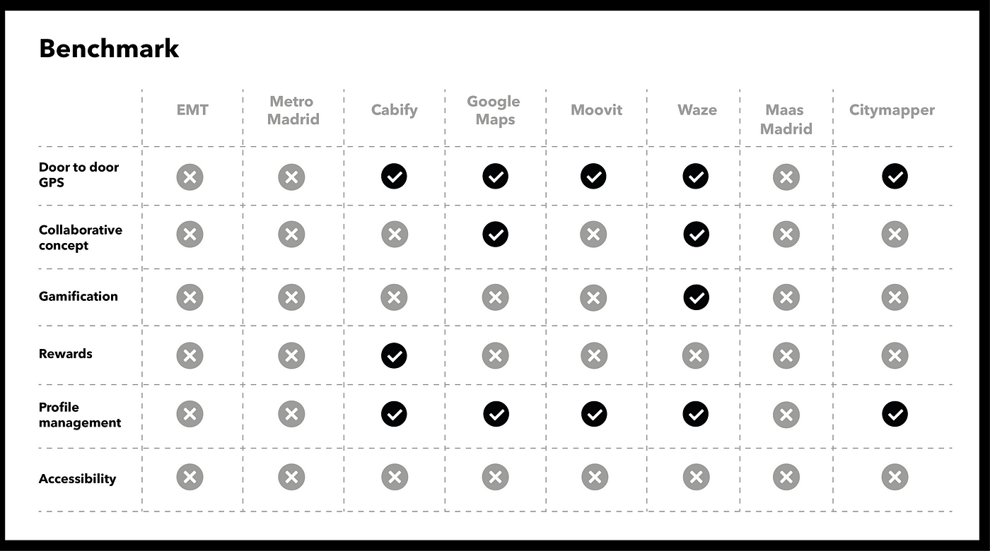
Benchmarking
Once the team defined the solution they made an analysis of the competition, their apps, and the functions included to compare with the ones pretend to apply to the EMT’s app.
Business model canvas
Always keeping in mind the main purpose, which is to increase the number of bus users in Madrid, the team created the business model canvas. Starting with the valued proposal, a cooperative information service in real-time, and ‘door to door’ route visibility, greatly benefit the EMT through the recollection of data from the app.
The team also evaluated the strengths and weaknesses of their proposal by doing a SWOT. By doing so, they also gained real perspective of the opportunities and threats that external facts represent.

Sitemap
Before developing the visual process of the app, the team created a sitemap including its functions. This helped them to define the component’s hierarchy and its general structure. It also guided them to decide each content location inside the app and how users will navigate through it.

Flowchart
The next step was creating a flowchart of the user’s interaction with two specific processes in the app. They decided to represent the process of searching a route and the login. In the graphic, the team reproduced with a gray arrow the journey of a regular user and in red the one of a logged user.

Design
Prototype
Most of the functions included in the app were based on an insight defined by the research phase. First of all, the GPS tool with the ‘door to door’ route option answers the need for an app that unifies others.
The team also added an alert function so people get notified when the bus is at the stop, and the option to filter in the map’s visualization the incidents reported by the community, street traffic, and the information of the bus approaching.
With these functions, the team responds to the need for self-sufficiency of the people with reduced mobility. Likewise, the example of the interviewed blind girl; does not have access to the information of the kind of bus she has in front of her unless she asks someone.
Prototipo Reto EMT from Violeta Goldin on Vimeo.
Moreover, the Community is the function that will stand out the most in the app. Through this feature logged users will be able to collaborate by reporting incidents in the buses, traffic in the streets, or some specific problem, like a ramp not working.
Users will get points for collaboration, depending on the type of contribution they do to the Community. The company will offer a bonus on the monthly ticket as a reward for their participation.
Example 2B: Design Thinking to improve urban transport in Madrid
EMT (Empresa Municipal de Transportes de Madrid) is incharge of public transport public urban transport in the city in Madrid, Spain. The company runs a fleet of 1,900 buses and 100 mobility aid vehicles and operates a network of 203 bus routes (176 daytime, 26 night-time, and Airport Express). The case study is shared by Angel Barreiro.
The Problem
The city conducted the study and realized that each year there are fewer customers who use this means of transport and users are more dissatisfied. The operator wanted to improve the experience of users who go by bus through the city. The target audiences were: the elderly, users with reduced mobility, the blind, the hearing impaired, or impeded.

The Project Scope
The method to make this project was a double diamond design thinking. The team divided it in two weeks, one to look for as much information as possible and the other to develop the future product.
To find out which ideas are best, the creative process is iterative. This means that ideas are developed, tested, and refined several times, so weak ideas will fall into the process.
Desk Research, Netnography and Benchmarking
The first step was to investigate as much as possible to give a solution to the following questions.
- Greater proportion of women
- High representation of seniors between 65 and 80 years old
- High concentration of residents in Corona A of Madrid
- Higher proportion of retirees and a lower proportion of students and workers
- Greater representation of trips by reason of leisure
- Majority use of the Transport Season Ticket/TTP
- There is dissatisfaction with the frequencies, which do not coincide with what is marked on the awnings.
- People travelling with baby carriages are dissatisfied with the accessibility and occupation of the platforms.
- There are numerous complaints about the poor accessibility of buses.
- People complain that buses pass by if they don’t raise their hands.
The case study is adapted from the original publication by Angel Barreiro
Design Thinking to improve Urban Transport in Madrid (April 2019)
👋 Social Media! Linkedin
💻 UI/UX design work: Portfolio
Discover
The team used 3 techniques to look for the information and empathize with customes
Safari (Where amazing happens)
Safari is a UX technique in which you go “to the place of facts” to understand and see how users behave. In this case, as they live the experience of moving by bus. When the team decided to go back by bus to see firsthand the behavior of users, the next day they had these conclusions:
- They complain that braking does not allow them to move around the bus.
- Older people get up one stop early to get out more comfortably
- Older people need the bus to tip over to get on and off.
- Satisfaction with the new information panels
- Insecurity for not knowing if there are free seats
- They complain about the impunity
- No possibility of transhipment
After putting all this in common the team decided to visit the nearest stop and see if they could get some more “finding”. To put in context, rainy day and the stop overflowing with people, the team positioned themselves as they could to protect ourselves from the rain and in less than 5 minutes all this arose.
A lady gave to activate the button to have the sonorous information. They realized that it did not work well, that it was sounded quite bad, especially by the traffic and the people talking. The team confirmed that the great majority uses the manure and queues are formed when entering the bus. And a lady lost the bus for not raising her hand, the lady was at the back of the stop and there were enough people in front of her so she did not have space and when she saw her bus pass by it was already too late, you can imagine the anger of the lady who “let off steam” with us ranting about the EMT and its service. Saying for example that before “she always stopped without raising her hand and did not understand why not now”. That talk with the lady gave us many clues as to what we could improve.
Surveys
At the end of all this, The team began to make a survey to have more information. The result was this:
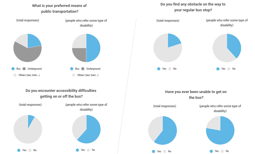
People with disabilities:
- They prefer to travel by bus.
- Most have trouble getting on or off the bus.
- They encounter obstacles until they reach the bus stop.
- Most have not been able to get on the bus at some time.
Interviews
One team member had the opportunity to do two interviews with elderly people (Mari Carmen and Merchi) of EMT type users and from there we got enough findings and they made the customer journey, empathy map, and the person.
Customer Journey
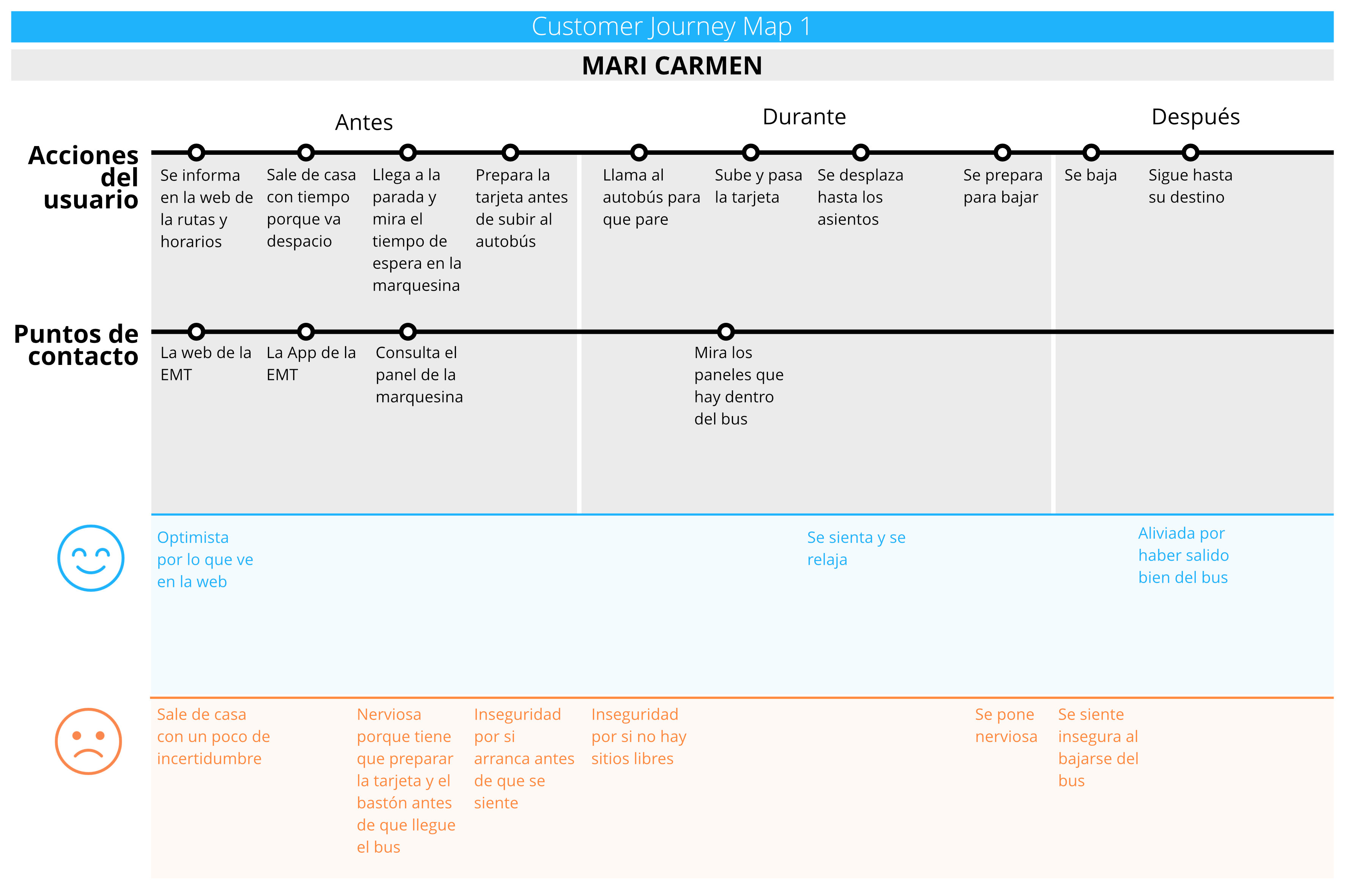
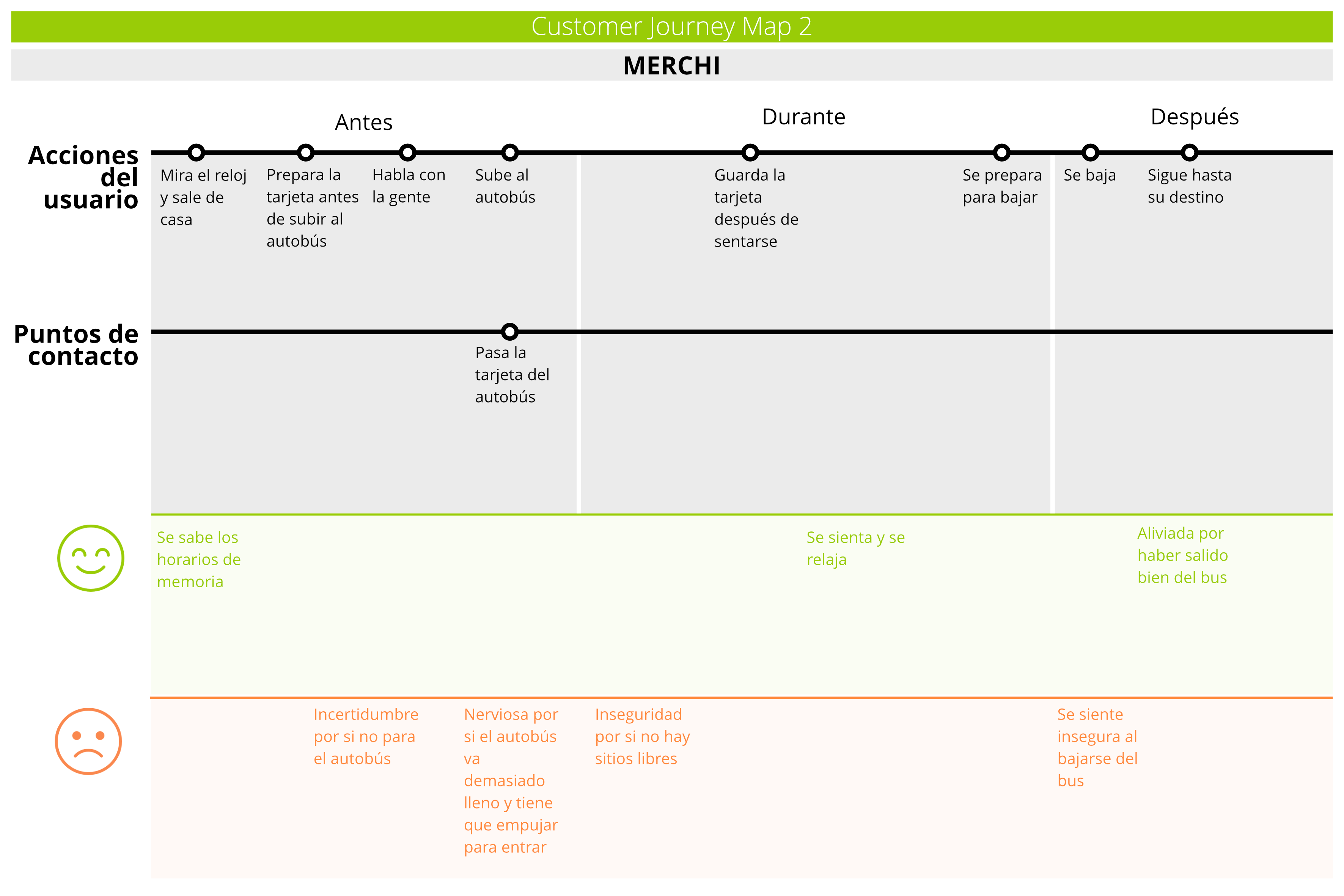
From all this we get the pain points that interviewees gave that were these:
- Most of them don’t have clear information about how many trips are left on the card.
- Need to know waiting times more accurately
- The moment to pay inside the bus generates a great stress
- If the bus is too crowded, they don’t get on.
- Have problems with bus accessibility (boarding and alighting)
Define
Facing the challenge
The team started the second week with the challenge: To improve the accessibility of users from the moment they arrive at the stop until they sit on the bus. This implies:
- Knowing waiting times
- Request bus stop
- To know if there will be room in the interior
- Know the balance of the transport card
HMW
Once they knew the challenge, through the HMW they posed questions to solve the challenge. The team divides it into arriving at the stop, at the stop, and during the trip.
Deciding HMW Questions
Develop
MoSCoW
After HMW the team did the MoSCoW process which is a simple way to rank user stories in order of priority. MoSCoW means: Must, Should, Could, Wont
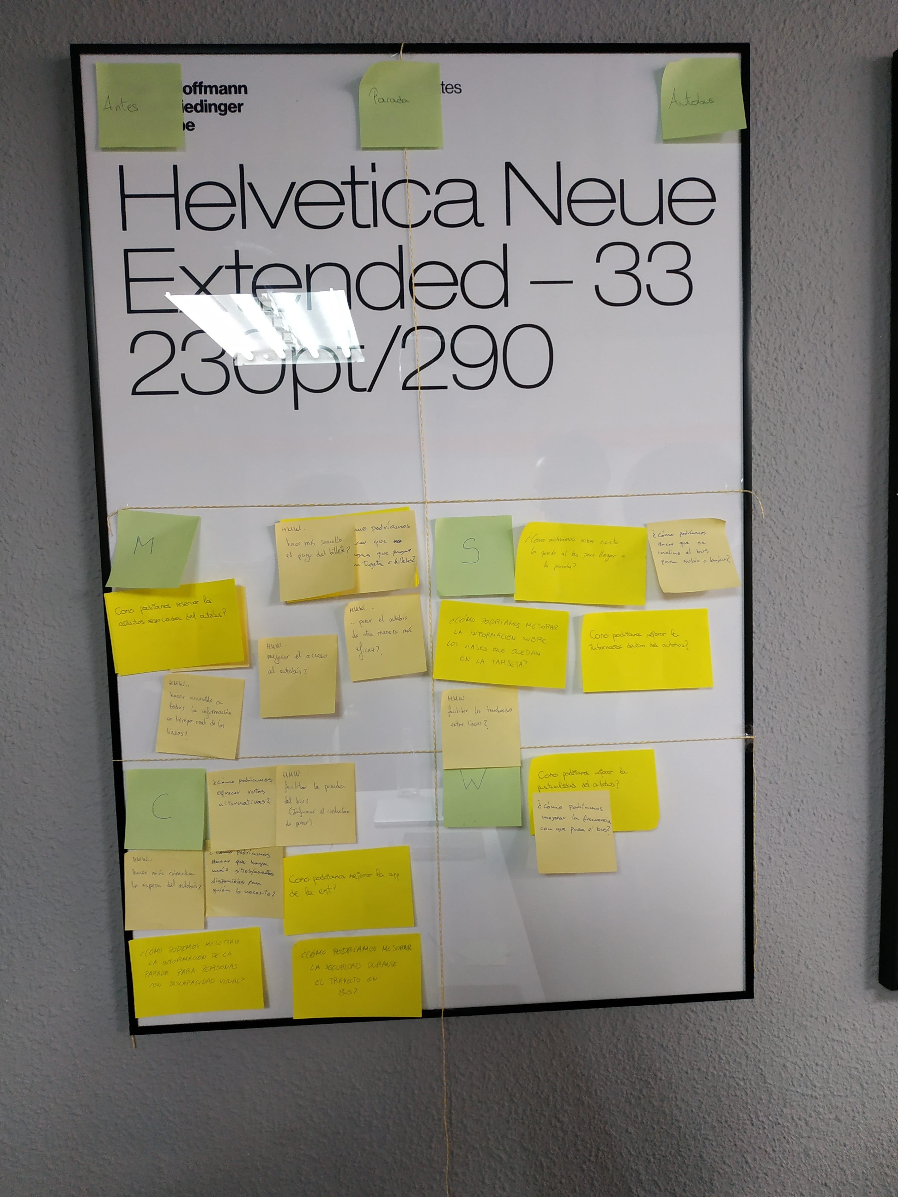
MoSCoW
Ideas to solve
Once the team was clear about the problems we were going to solve, they brainstormed possible solutions and chose those that were more interesting or more viable. At the end, the team was talking about which would be the best solution and decided to make a **smart stop.
Design
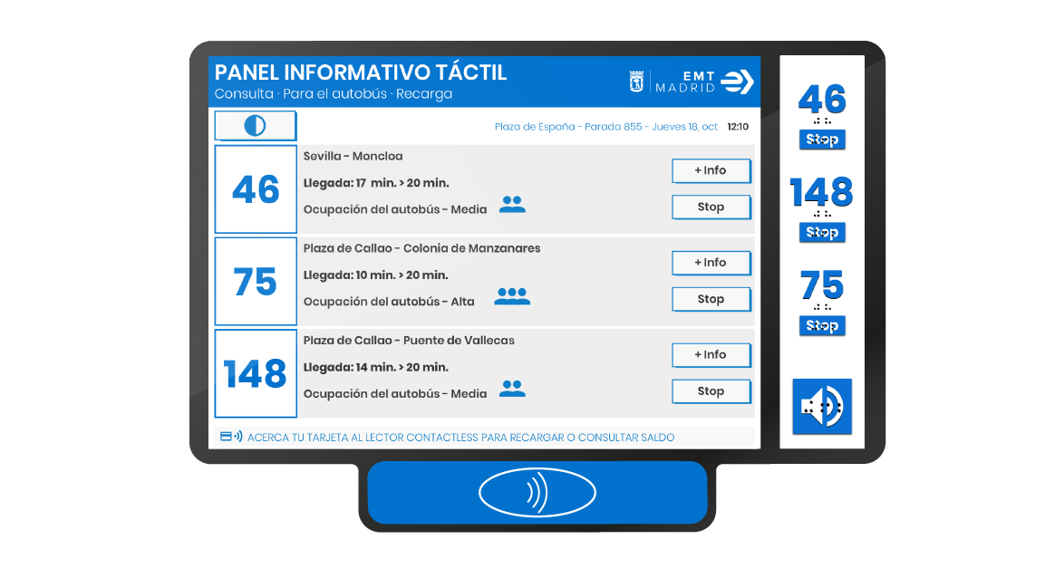
Smart stop
Smart stop scheme
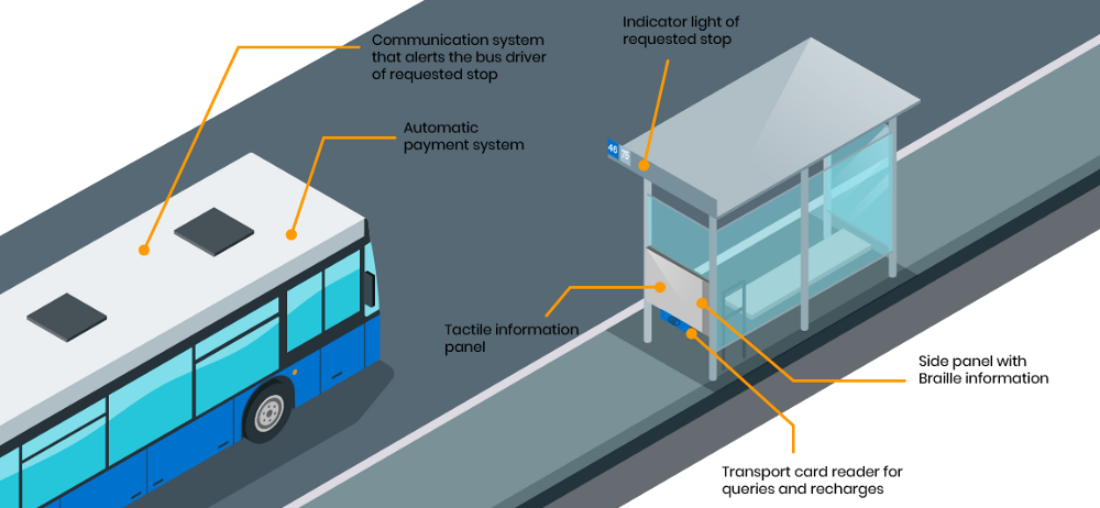
The operation of the stop is as follows. Through Beacons placed at the stop and on the bus. It would send information about whether it has to stop or if there is someone in a wheelchair so that the driver is more careful when parking.
At the stop there will be a touch panel that shows the stop information (bus number, route, bus occupancy, being able to ask the bus to stop, knowing/recharging your card balance) Next to the touch panel there will be a side panel with Braille information.
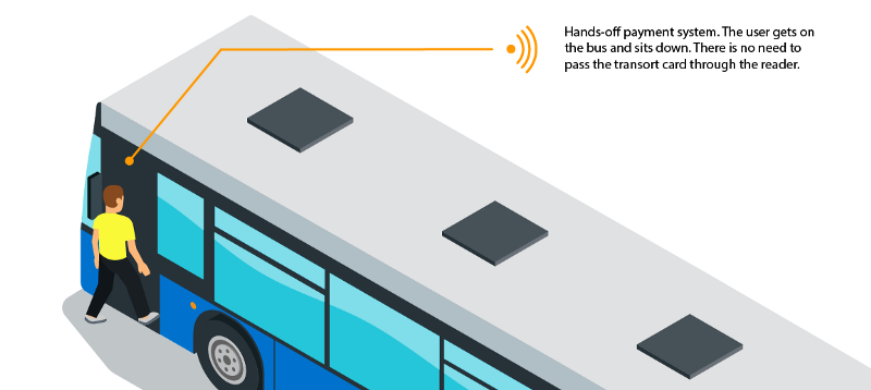
To make the payment, the team would use the DSRC system, which is the same system used by highways with electronic tolls. It would be a wireless charge in which people each time they ride the bus would pass through an arc located in the door of the bus in which the collection of the trip would be made. This would only be valid for people who have the transport pass. With this, the team try to avoid the stress moment that Merchi and Mari Carmen told us that happens to them every time they have to get on a bus and would also speed up the entrance queues.
In terms of occupancy, we will use the Amazon go system. The system uses cameras to track people’s movements and identify their interactions with products. It will serve with a heat map to know the occupation of the bus.
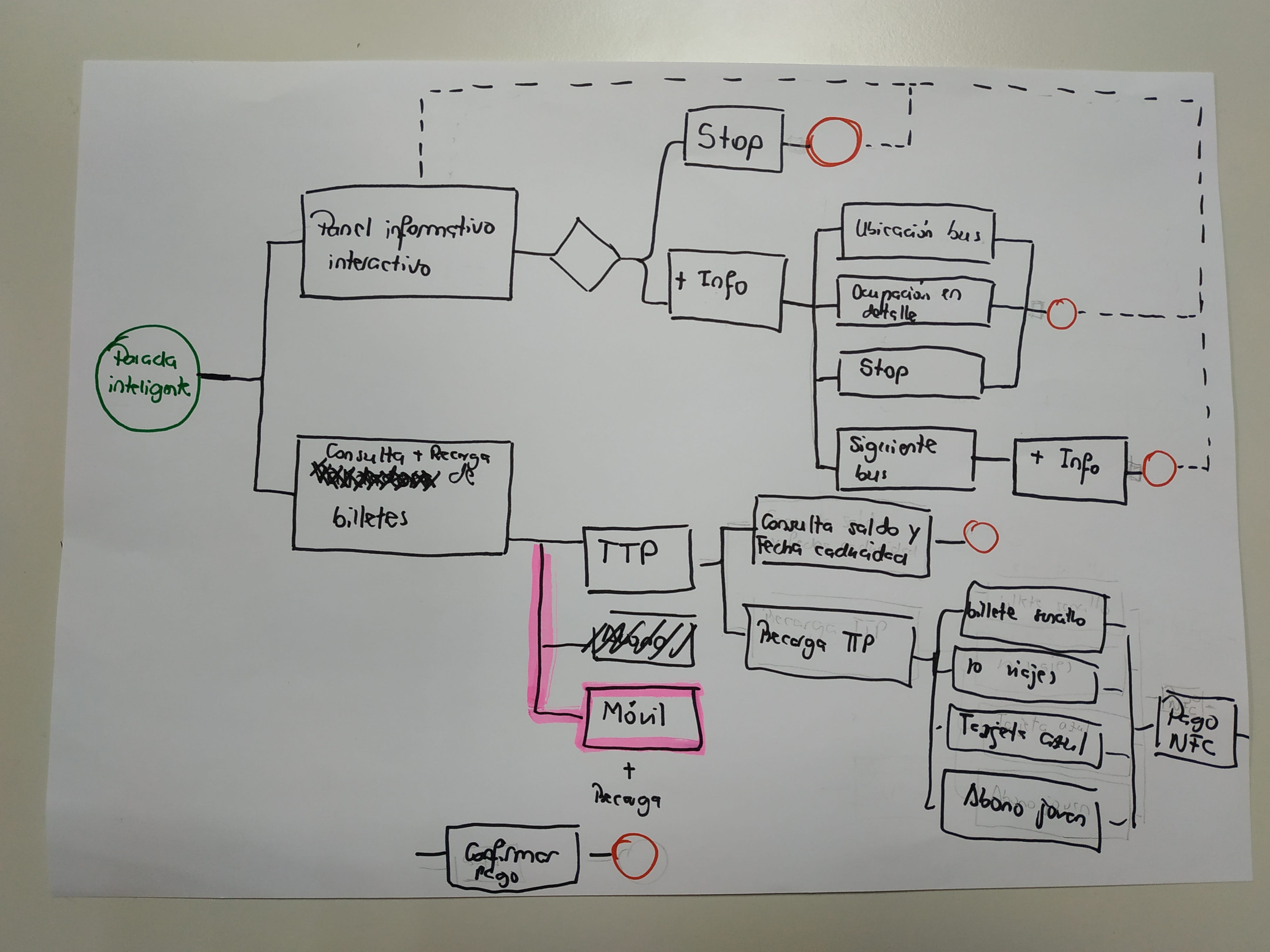
Flowchart and Wireframes
The team designed the flow chart and wireframes to present the solution.
Functionalities discarded
A big part of the challenge, the team spent iterating. Solutions that we thought could be implemented but that in the end it didn’t know/could do.
- Reservation of seats and spaces, since the few possibilities of control, could generate greater frustrations.
- Cannot control the destination of passengers (even the user may not know their final destination stop).
- System failures may occur
- The stop and the descent can coincide in the same stop and it is difficult to synchronize both actions.
- Payment by card of amounts greater than 20€, as it would be necessary to consider a process that would allow the secret code to be entered securely and is difficult to reconcile with the rest of the functionalities.
Example 3: Improving Urban Mobility thanks to Design Thinking
Urban Go is a public transit and mapping startup based in Silicon Valley. The company’s goal is to solve the problems of urban mobility by offering the quickest and cheapest public and private transport routes to their users. The case study is shared by Madalena da Silva
The Problem
The main pain point for most users is the different amount of public transport tickets they have to purchase when going from point A to B.
Why? Because oftentimes, purchasing these tickets can be very annoying (queues, vending machines, etc.) and most likely include paper or plastic cards. Also, things like pricing or purchasing the correct ticket can become a real pain when you are abroad.

The Project Scope
The first 4 steps of the Design Thinking process to solve that problem:

For the purpose of this challenge, this is what was known:
- UrbanGo already developed a mobile application for its users;
- The users can select a starting point and a destination, and the app provides different multimodal routes with the estimated time and cost;
- The users already have all their information on the app, they will neither need to log in nor enter any data when paying/checking-out;
- Security issues and other limitations are to be ignored — the focus must be on finding a quick and user-friendly solution.
And this is what the main task was:
- Create a feature for this app that solves the pain of having to purchase different public transport tickets by different channels.
The case study is adapted from the original publication by Madalena da Silva
Improving Urban Mobility via Design Thinking @ Medium (February 2020)
💻 UI/UX design work: Portfolio
Empathize
Step 1: Personal introspection
Before engaging in any further activity, it was important to answer these questions to have a better point-of-view to take on the work ahead:
- What problem are you solving? Solving the pain of having to purchase different public transport tickets by different channels.
- Who is your audience? Anyone that has used public transport in their hometowns but also abroad.
- Who is your client’s competition? Main competition is Google Maps, CityMapper, MOVEit and other local transport apps.
- What’s the tone/feeling? The feeling one wants to achieve is of ease, reliability, and convenience.
Step 2: Interview preparation
The interview guide was prepared to find out more about my users’ habits and what’s important to them when it comes to public transportation, using the Google Form (Click HERE).
Step 3: Interview & analysis
15 users aged 18–83 were interviewed that frequently use public transport in their hometown as well as when traveling abroad. For geographical reasons, the interviews were conducted remotely by following the Interview Guide.
The survey results were used in Design Thinking process.

Define
Step 1: Findings
After the Empathize phase, One got a clearer idea of what the main pain points of the users were when it comes to using an app such as UrbanGo. Here are the top 3 features that would make it or break it for them:
- the ease of purchasing ticket deals — packs, top-ups, and monthly passes;
- the availability to cover ALL public transportation needs in one place;
- the accuracy of the info provided, including ticket price and live updates;
And here are some nice-to-haves:
- the existence of filter options such as choosing a date, time, and language;
- the convenience of connecting the app to an actual physical card;
Step 2: Problem Statement
These findings led to defining a problem statement focused on the user’s viewpoint and the problem that they want to see fixed. It defines WHO the user is, WHAT it wants, and WHY it wants it.
Both locals and tourists need to find a way to purchase ALL types of ticket deals for ALL their public transportation needs in ONE place because vending machines malfunction all the time, they don’t want to wait in queues and they are looking for the cheapest, fastest and most efficient option.
Ideate
Step 1: Brainstorm
Based on the Findings and Problem Statement of the Define phase, the team used brainstorming techniques to generate lots of ideas to solve the problem:

Step 2: Top 3 Solutions
After getting a better understanding of the product and all the possibilities, I rounded it down to three focused solutions:
All-Inclusive Ticket Purchase & Wallet — a fun visual interface with all the ticket options of your current locations (with option to filter to a different location and buy tickets in advance for your upcoming trip) and a ticket wallet with all your new tickets categorized by location (or option to change category filter to expiry date, etc..) as well as your ticket history!
Digital/Physical Integration — a purchase system that connects with local public transportation systems and allows for the integration of digital and physical. The purchase could be done either through the app, vending machine or any other local options and you could use the resulting ticket or pass through the app or your travel card (just like with online banking and debit cards — an action on one reflects on the other!).
Next-Level Update & Notification System — an intelligent system that would give you real-time updates, ping you when you’re going in the wrong direction or when you are late for your usual transport, notify you when your ticket/ monthly pass is about to expire, and inform you of all transport options and best practices as soon as you land in a new city!
Prototype
For the purpose of this challenge, The team picked only one of the solutions ideated above — the All-Inclusive Ticket Purchase & Wallet — and developed it in a few hand-sketched screens:

Loading Viewer...